Cutting Through the Curse of Dimensionality
Published:
This article explores the fundamental intuition of dimensionality reduction techniques.
Back when I was doing coursework in financial econometrics and data mining, the Bias-Variance Tradeoff was a constant theme. Essentially, Bias is the error that results from a learning algorithm making the wrong (often too simple) assumptions. Variance is the error that comes from the model being too sensitive to the specific fluctuations in the training data.
Their relationship is inversely proportional. When bias is high, variance is usually low, and vice versa. This means that when the error from algorithm assumptions is high, sensitivity to the training data is low. Basically when a model is too stubborn with simple assumptions, it becomes less reactive to the specific quirks and noise in the training data. While the ideal sweet spot is having both low bias and low variance, mathematically that is impossible. The goal is simply to find a delicate balance between them.
As a math guy, I find it helpful to visualize why this balance is necessary. In a regression case, the Mean Squared Error (MSE) decomposition is expressed as:
\[E[(y - \hat{f}(x))^2] = Bias[\hat{f}(x)]^2 + Var[\hat{f}(x)] + \sigma^2\]Since the relationship between bias and variance is inversely proportional, both errors must be kept low, otherwise, the overall MSE skyrockets!
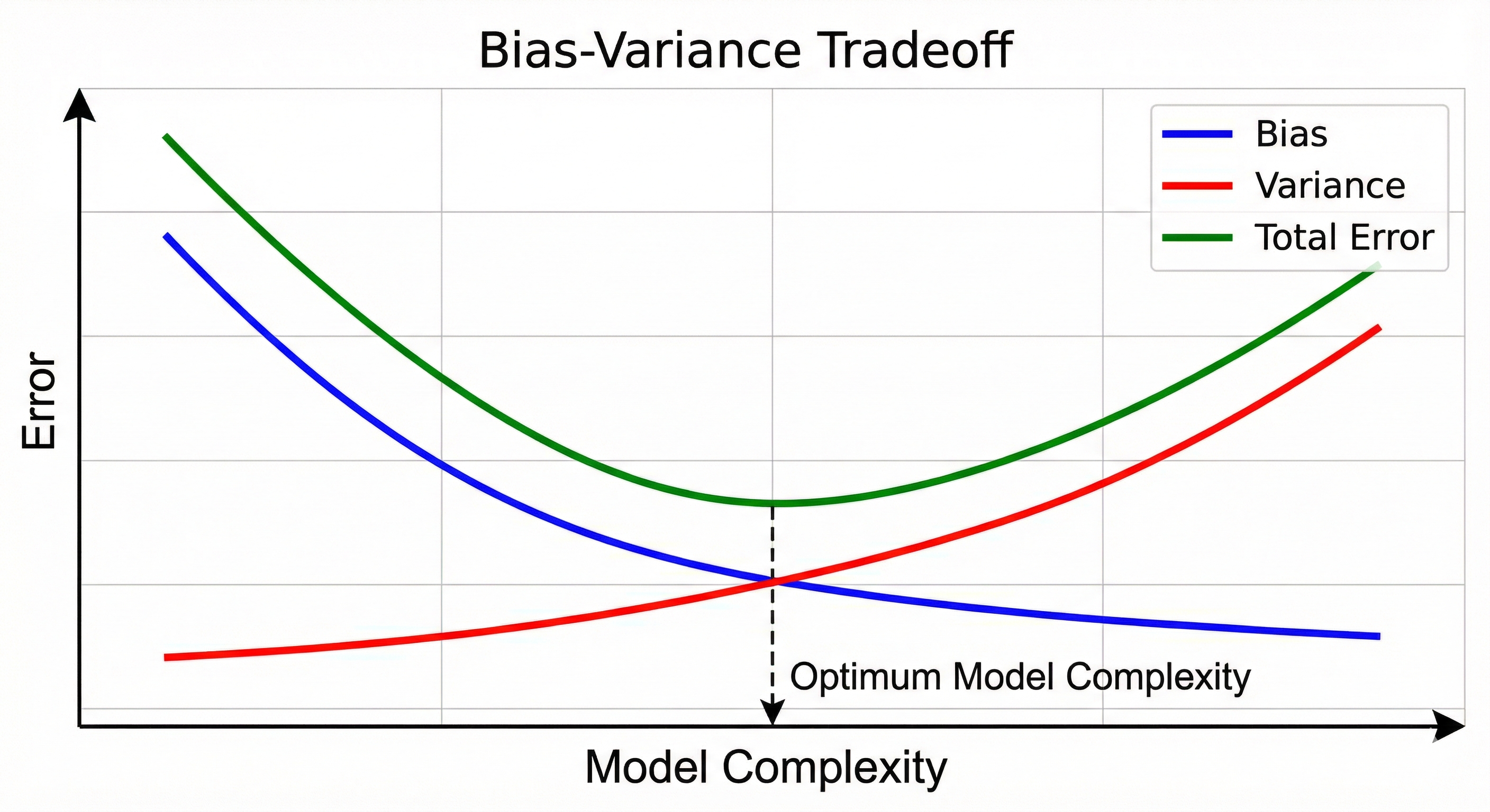
In the context of dimensionality reduction, the aim is to find that balance specifically when variance is high. Extra dimensions must be cut to lower the variance without oversimplifying the model to the point that bias becomes a problem.
But when the bias is high, the method is not dimensionality reduction, typically it is feature engineering or increasing model complexity to help the algorithm actually capture the underlying patterns it is currently missing.
So dimensionality reduction is all about lowering the variance within the Bias-Variance Tradeoff.
Why More Data Usually Means More Problems
First, why even learn dimensionality reduction? Because if you cannot condense 500 job requirements into one human skill set in this economy, you might not survive the recruitment filter.
I probably overfitted that joke, but we’ll move on :)
The main purpose of dimensionality reduction is to make data less complex so the learning algorithm can understand it more meaningfully. In the real world, data is often messy and high-dimensional. For instance, if you have 300 features for a machine learning prediction, using every single one will often lead to low performance. Even if you remove the obvious weak features, the sheer volume of features can overwhelm the model with noise. This is often called the Curse of Dimensionality.
It is the same with image data. Think about a small 100x100 pixel grayscale image. That looks tiny, but to a computer, that is 10,000 features because every single pixel is a variable. If you are trying to recognize a face, most of those pixels are just background noise or redundant information. Using all 10,000 dimensions makes the math incredibly heavy and prone to overfitting.
For text, the problem is even more extreme. Every unique word in the dataset becomes a new dimension, meaning a simple document can easily turn into a feature vector with tens of thousands of columns. Most of these words are sparse or irrelevant, so dimensionality reduction is used to distill those thousands of words down to a few core topics that actually represent the meaning of the text.
Reducing the dimensions helps the model focus on the actual signals that matter rather than getting lost in the noise. It makes models faster and usually more accurate because they are not over-complicating the relationship between variables.
Picking the Right Tool for Dimensionality Reduction
In this article, I will briefly explain the intuition behind six major algorithms: PCA, LDA, SVD, t-SNE, UMAP, and Autoencoders. There won’t be too much math involved since the goal is to develop a geometric feel for how these tools actually function.
The best way to organize these methods is by their mathematical logic.
The Linear methods includes PCA, SVD, and LDA. These are excellent for simple and flat data structures. PCA and SVD are unsupervised, which means they analyze the data as it is. In contrast, LDA is supervised and requires labels to help separate different classes.
Then there are the Non-Linear methods like t-SNE and UMAP. These are unsupervised and perform better on curvy or complex data, making them ideal for data visualization.
Autoencoders represent the deep learning approach. They use neural networks to perform dimensionality reduction with significantly more flexibility and offer the ability to handle extremely complex data that traditional math might miss
PCA: Maximum Variance
Principal Component Analysis (PCA) transforms high-dimensional data into a smaller set of new dimensions by creating linear combinations of original features that still contain most of the original information. The core intuition here is to maximize the variance of the dataset.
Imagine a dataset in 3D space with three variables: $x, y,$ and $z$. Our goal is to transform this into a 2D plane. In a standard regression or a simple data mining approach, you might just keep the two variables with the highest correlation to your target. That is Feature Selection.
But PCA is Feature Extraction. We do not simply pick the best two original variables. We look for a new set of axes, which are linear combinations of the original features that capture the maximum possible variance.
Since we are working in a 3D space, we will have exactly three Principal Components. Why? Because PCA is essentially a change of basis. We are rotating our original $x, y, z$ coordinate system into a new $PC_1, PC_2, PC_3$ system. You can’t have more than three because you can’t find a fourth direction that is perpendicular to the first three in 3D space. You didn’t lose the dimensions yet, you just reorganized them.
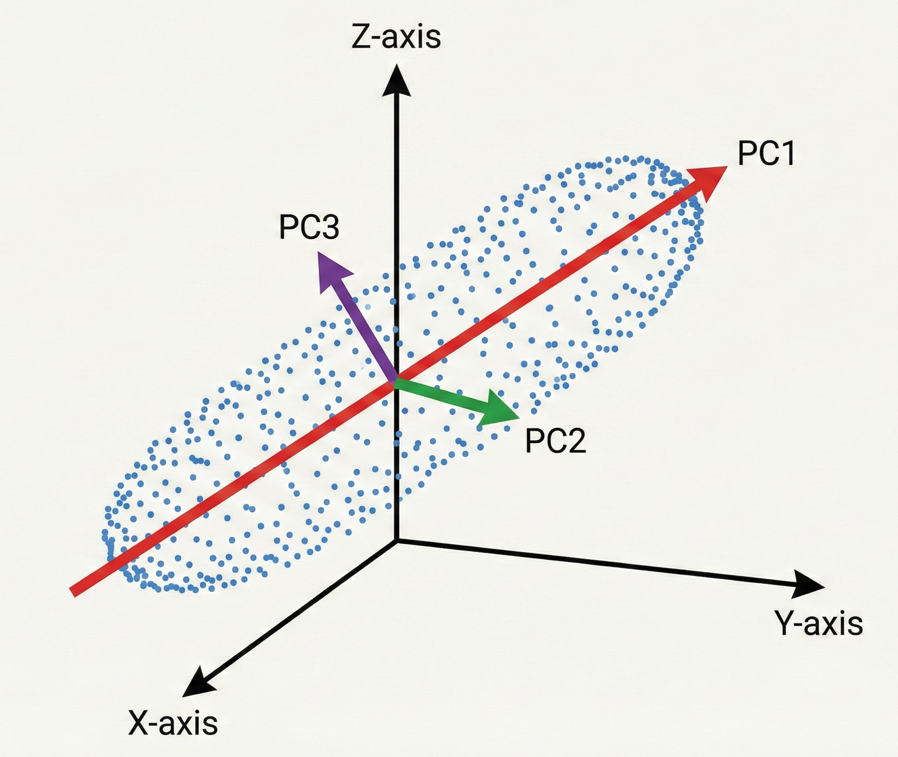
The Geometry of a Principal Component
A Principal Component is just a fancy way of describing a new feature that is a weighted sum (linear combination) of your original ones.
This process begins by identifying the First Principal Component ($PC_1$). This is the specific vector in 3D space along which the data is most spread out. It represents the strongest signal in your dataset.
Once $PC_1$ is locked in, we find the Second Principal Component ($PC_2$). There is a mathematical catch: $PC_2$ must be strictly perpendicular (orthogonal) to $PC_1$. By being perpendicular, $PC_2$ ensures it captures only the remaining variance that $PC_1$ missed without any redundant overlap. Because they are orthogonal, the components are statistically uncorrelated.
Finally, $PC_3$ is the last perpendicular axis, capturing whatever tiny bit of jitter is left.
To put this in perspective, imagine your calculations for a 3D dataset show:
- $PC_1$ explains 95% of the variance.
- $PC_2$ (the perpendicular mix) explains 4%.
- $PC_3$ (the final perpendicular axis) explains only 1%.
Since we want to get only 2 features, we drop $PC_3$ since it doesn’t contain much information as it explains only 1% of the dataset. So we have effectively traded a 33% reduction (one out of the 3 dimensions has been removed) in data size for a mere 1% loss in information.
Scaling Up to Higher Dimensions
What happens when we move from our 3D example to a massive dataset with 100 features? The logic remains exactly the same, just harder to picture. PCA still finds 100 perpendicular components and orders them systematically based on the variance they carry.
Think of this as the 80/20 rule for data. In a 100 dimensional space, the first handful of Principal Components often capture the vast majority of the variance. The remaining components typically represent digital background noise.
To decide where to cut the dimensions, we look at the Eigenvalues. In geometric terms, an Eigenvalue is a number representing the length of a Principal Component.
We can create a Scree Plot by ranking these eigenvalues from largest to smallest. This allows us to see the exact point where the information plateaus. We keep the $k$ components that matter and discard the rest.
Determining the Value of k
When we move to 100 dimensions, we need a objective way to choose $k$, which is the number of dimensions we keep. This depends on the Cumulative Explained Variance.
In most data science workflows, the goal is to retain enough components to account for 70% to 90% of the total variance. If the first 10 components capture 85% of the variance, then $k = 10$. This allows us to discard 90 dimensions while losing only 15% of the actual information.
A Technical Summary of the PCA Process
Let me summarize the mechanics in a more techincal way. Principal Component Analysis reduces dimensionality by identifying the top $k$ principal components that capture the maximum variance while discarding the rest.
The mathematical process follows a specific logic
- We calculate the Covariance Matrix ($\Sigma$) to see how all 100 features relate to each other
- We perform Eigendecomposition on that matrix to solve the characteristic equation $\text{det}(\Sigma - \lambda I) = 0$ to find Eigenvectors and Eigenvalues
- The Eigenvectors ($v$) define the new directions for our data where each eigenvector is strictly perpendicular to the others
- The Eigenvalues ($\lambda$) represent the variance or power along those new axes
- We rank the components by their Eigenvalues to select the optimal $k$ based on the variance thresholds mentioned above
Projecting data onto the top $k$ eigenvectors preserves the core signal while reducing dimensions. This effectively compresses a mansion into a functional home without losing structural integrity.
LDA: Maximize Class Separability
If PCA is about retaining the highest variance, Linear Discriminant Analysis (LDA) is about finding the most distinction.
The fundamental difference is that LDA is supervised while PCA is unsupervised. But what does that actually mean in practice?
PCA is Blind But LDA is Not
When we talk about PCA, it is important to notice that the algorithm does not need any labels to do its job. Imagine you have a massive dataset of animal measurements but you do not know which data point belongs to a cat, a dog, or an elephant.
PCA is unsupervised because it is blind to these categories. It relies purely on math to find the directions of maximum variance regardless of what those points represent. It simplifies the data based on how much it spreads out, not based on what the data actually is.
LDA is supervised because it takes those animal labels into account. If you are trying to distinguish between different species, PCA might find a direction that explains the general size or weight of the animals. However, LDA will specifically hunt for the axis that maximizes the gap between the clusters.
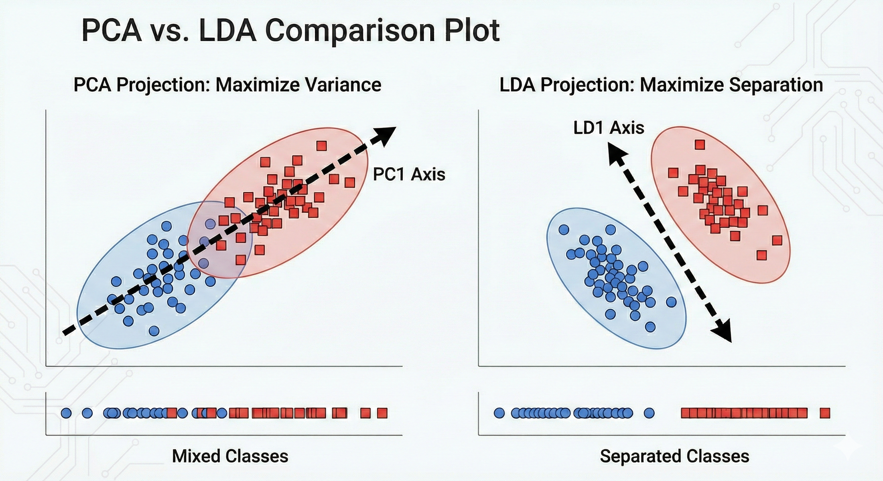
I often think of this way. PCA looks at the whole forest and finds the direction where the trees are most spread out. LDA looks at the species of the trees and finds the direction that best separates the oaks from the pines
Essentially, LDA wants the clusters to be as far apart as possible from each other while being as tight as possible individually. This makes it a much more powerful tool when your goal is classification rather than just general data simplification.
The Intuition of the Gap
The idea of LDA lies in how it handles the noise within a group versus the signal between groups. It evaluates data based on two specific goals
- Maximize Between-Class Scatter ($S_B$) which means pushing the centers of the groups as far apart as possible
- Minimize Within-Class Scatter ($S_W$) which means squashing each group into a tight, dense cluster
When you project high-dimensional data onto an LDA axis, you are looking for the view that creates the cleanest gap. This ensures that when a classification model looks at the data later, the boundaries between categories are obvious and distinct.
The Dimensionality Constraint of LDA
There is a hard mathematical limit to LDA that does not exist in other methods. You are strictly limited by the number of classes ($C$) in your dataset. The maximum number of dimensions LDA can produce is $C - 1$.
To understand why, think about the geometry required to separate objects
- To separate two groups, you only need to look at them along a single line. If you can find the right line, you can tell them apart.
- To separate three groups, you only need a 2D flat plane. Think of three points forming a triangle on a sheet of paper. You do not need a 3D box to describe their positions relative to each other.
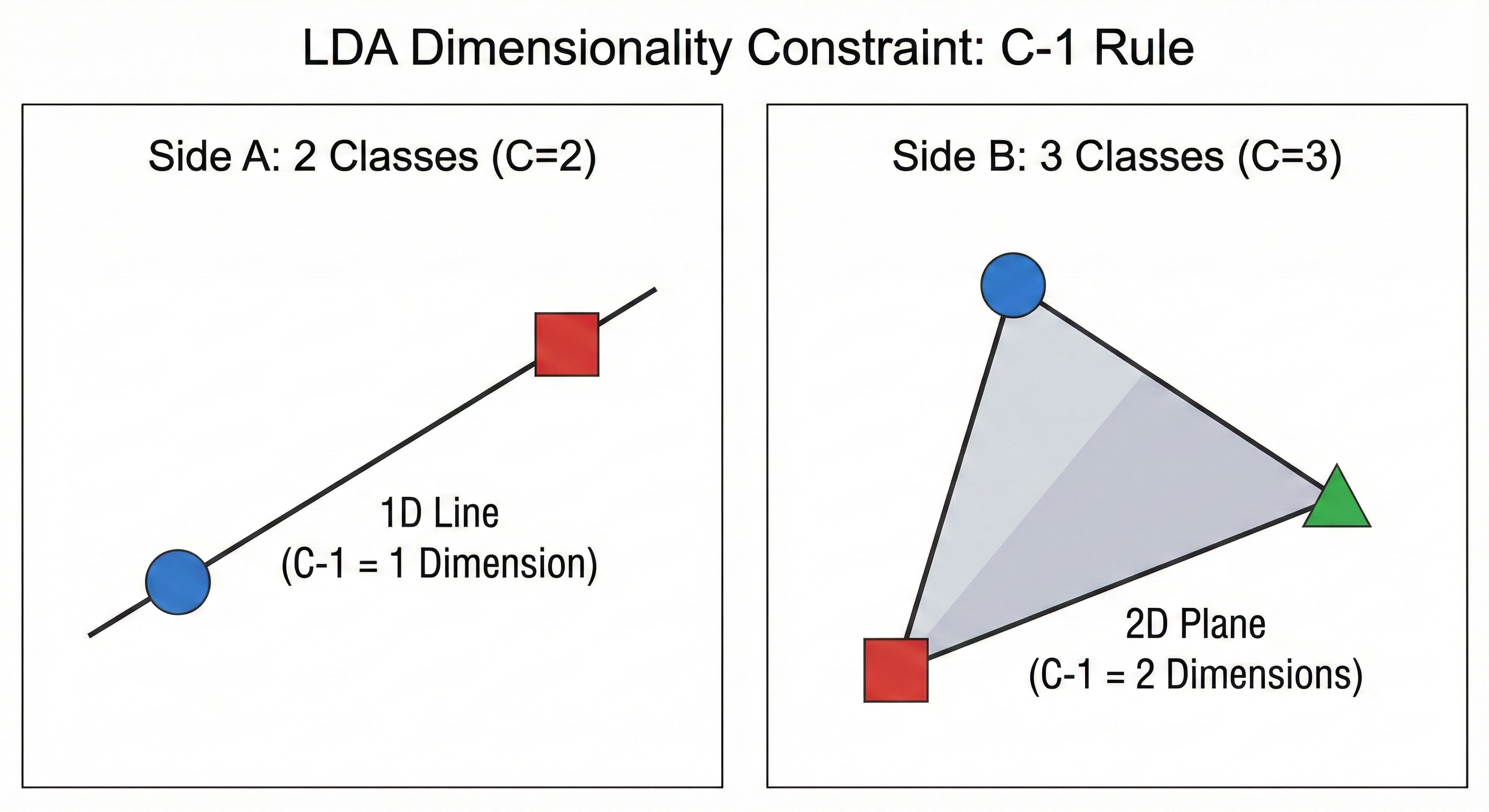
This is why LDA is so aggressive with dimensionality reduction. If you have 100 features but only 3 categories of animals, the algorithm realizes that any information beyond two dimensions is redundant for the specific task of separation. It distills that entire 100D space down to just the two meaningful directions that actually define the gaps between your groups.
A Technical Summary of the LDA Process
The mathematical logic of LDA follows a similar matrix-to-axis flow as PCA, but with a focus on class scatter rather than global covariance.
The process follows this specific logic
- We calculate the Within-Class Scatter Matrix ($S_W$) to see how spread out the data is inside each individual group
- We calculate the Between-Class Scatter Matrix ($S_B$) to see how far the centers of the groups are from each other
- We perform Eigendecomposition on the matrix product $S_W^{-1}S_B$ to find the Eigenvectors and Eigenvalues
- The resulting Linear Discriminants ($LDs$) are the new axes that maximize the ratio of between-class variance to within-class variance
- We rank these by their Eigenvalues and keep the top $k$ components where $k$ is less than or equal to $C-1$
While PCA is a general-purpose tool for simplifying data, LDA is a targeted tool used when you know exactly what categories you want your model to distinguish.
SVD: Discover Latent Structure
Singular Value Decomposition (SVD) is a fundamental matrix factorization method that decomposes any $m \times n$ matrix into three constituent matrices. It uncovers latent structure, which refers to the underlying patterns linking features and observations that are not explicitly labeled.
In recommendation systems, SVD performs a low-rank approximation. For example, in a movie streaming service, the raw data is a sparse matrix where rows are Users and columns are Movies. SVD identifies Latent Factors, which are hidden categories like Explosive Action or Nostalgic Vibes discovered through user interactions. What are these exactly? No idea as I just made them up but the point is to convey that there are hidden genres that humans can typically classify.
SVD identifies these traits mathematically and compresses the sparse data into a lower-dimensional set of features. This allows the system to predict what a user will like based on their proximity to certain latent factors, essentially capturing the essence of their taste.
The SVD Mechanism
Imagine a massive table of 10,000 users and 5,000 movies. The goal is to understand what people actually like. Most of the table is empty because no one watches everything. This is a sparse matrix. If you try to analyze it as is, you are looking at a giant map. SVD looks at this map and realizes that you do not need 5,000 movie columns to understand a user. You only need to know how that user relates to a few latent factors.
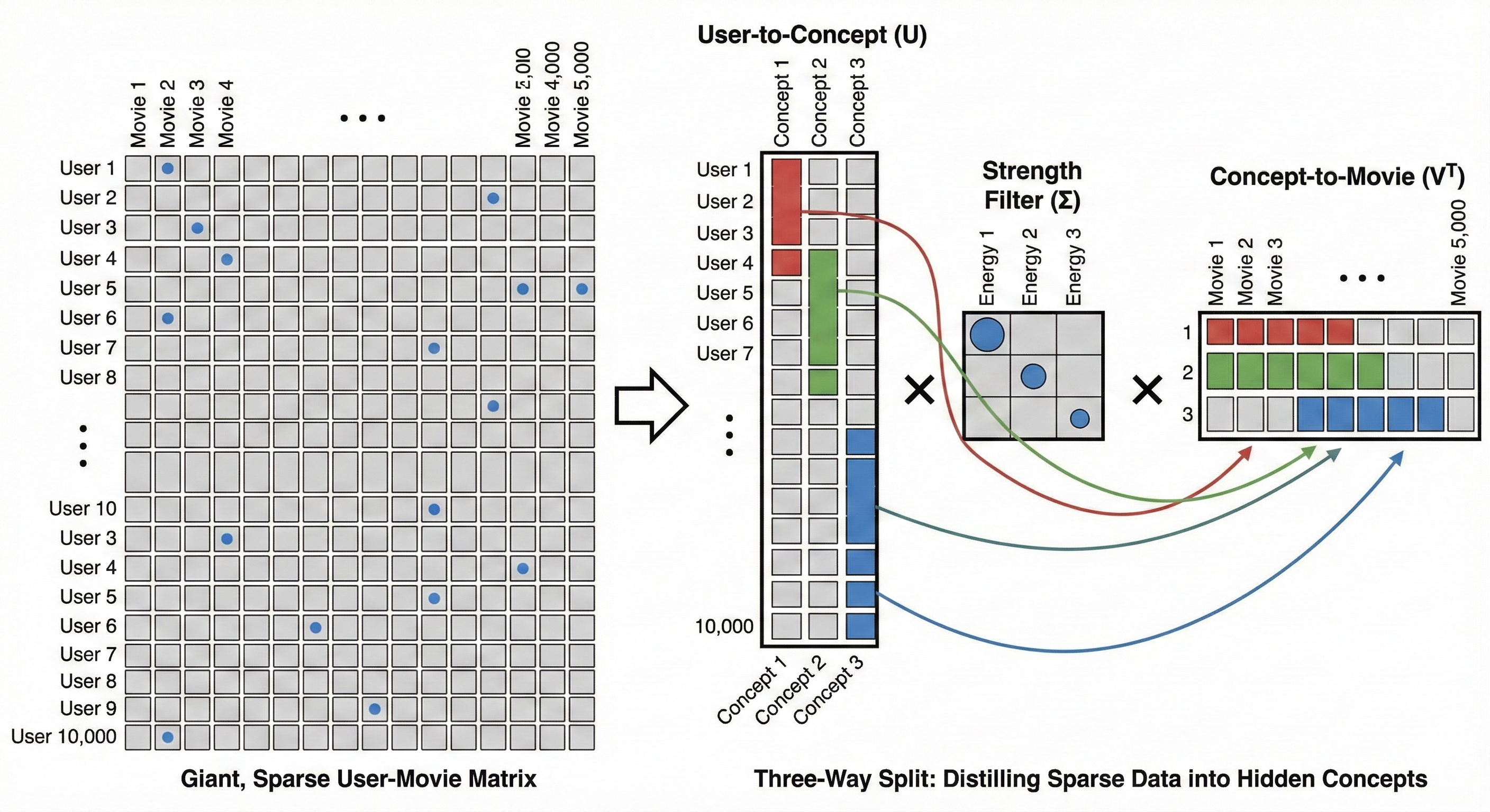
SVD performs a three way split to find these hidden categories.
The User Map ($U$) groups users who share the same vibe. Instead of looking at 10,000 individuals, SVD sees how each person aligns with the hidden latent factors.
The Strength Filter ($\Sigma$) identifies which of these hidden factors actually matter. It ranks them by energy. In this context, energy is the mathematical weight of a pattern. If 8,000 users all watch similar fast-paced movies, that pattern has high energy. If only two people watch a specific niche film, that is low energy noise. We keep the high energy factors and discard the low ones to filter out the jitter and focus on the real signals.
The Content Map ($V^T$) groups the movies by those same hidden concepts.
This is how SVD discovers patterns like the Explosive Action mentioned earlier. The algorithm does not know these words, but it sees the mathematical connection between a group of users and a group of movies. The system can recommend a film you haven’t seen yet by focusing on these high energy latent factors because it sits in the same mathematical bucket as your favorites.
The Geometry of SVD
While the User Map and Content Map help us see the data as tables, the underlying math is performing a geometric dance. If you imagine your data as a cloud of points floating in a high dimensional space, SVD is the process of finding the primary axes of that cloud.
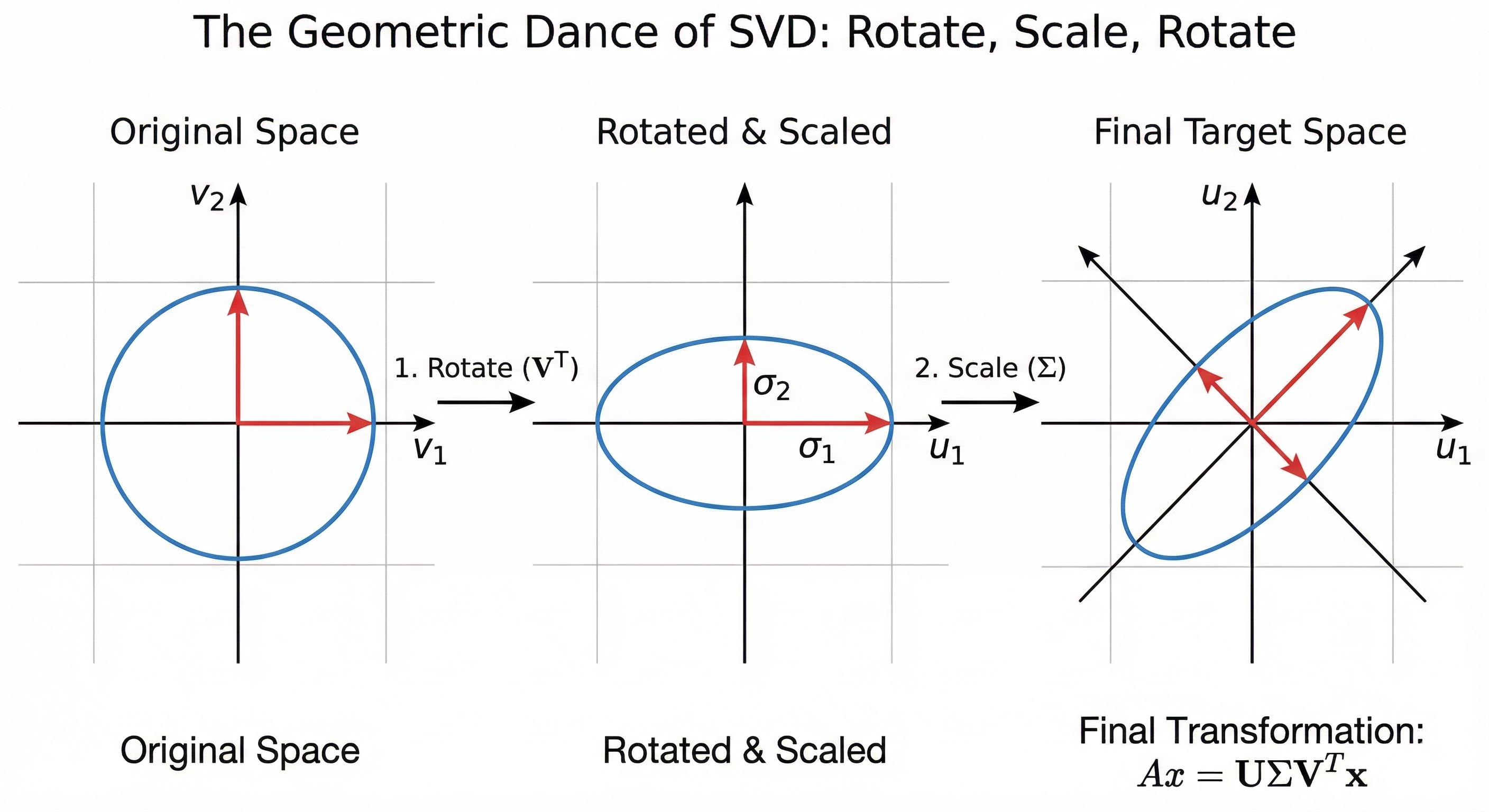
SVD tells a story of how a standard circle is twisted and stretched into the complex shape of raw data through three movements. First, Rotate ($V^T$) turns our perspective like a camera to align with the natural tilt of the data without changing its shape. Next, Scale ($\Sigma$) uses Singular Values to stretch axes with high energy signals and squish those representing noise, transforming the circle into an elongated ellipse. Finally, Rotate ($U$) takes this simplified, essential shape and rotates it into the final coordinate system of our rows to map core concepts back onto the original players in the dataset.
Think of the Singular Values in the $\Sigma$ matrix as the length of these axes. The first and largest value represents the direction where the data is stretched the most, capturing the strongest signal. As you move to smaller values, the axes get shorter and shorter until they eventually just represent tiny jitters of noise.
We are effectively flattening the data cloud into a simpler shape by keeping only the longest axes, . This is why it is called a low-rank approximation. We are intentionally squashing the dimensions that do not matter to highlight the ones that do. It is like taking a complex, 3D sculpture and finding the perfect 2D shadow that still tells you exactly what the object is.
SVD vs. PCA
In data science, the shape of data matters. While many statistical methods assume square matrices (where rows equal columns), real-world data is almost always rectangular (e.g., 10,000 customers vs. 20 features).
One fundamental difference lies in data preparation. PCA via Eigendecomposition requires a square and symmetric matrix. Specifically, it operates on the Covariance Matrix $X^T X$. SVD is a more flexible factorization tool. It can be applied directly to the original $m \times n$ rectangular matrix $X$ without needing to transform it into a square format first.
PCA is designed to find Principal Components with the highest variance. While SVD is often used to compress a matrix to a smaller size, its purpose in PCA is more specific. SVD decomposes a matrix into Singular Values which represent the importance or energy of each dimension. If you center your data by subtracting the mean, the results of SVD and PCA become identical. The Right Singular Vectors from SVD become the Principal Components of PCA. This means SVD reaches the same statistical goal as PCA but uses a different mathematical path.
Most modern data science libraries like scikit-learn use SVD as the underlying mathematical engine to compute PCA. It is a misconception that SVD prepares data for PCA. Rather, SVD replaces the need for the computationally expensive and numerically unstable Eigendecomposition of a covariance matrix. SVD identifies the same principal components by decomposing the rectangular data directly. This avoids the precision errors that happen when you square the data to create a covariance matrix.
A Technical Summary of the SVD Process
The mathematical logic of SVD allows it to handle any matrix regardless of shape while bypassing the instability of squaring data.
The process follows this specific logic
- We take an $m \times n$ matrix $A$ and factor it into the product of three specialized matrices $U$, $\Sigma$, and $V^T$
- Left Singular Vectors ($U$) define the new coordinates for our rows. These are the eigenvectors of $AA^T$ and represent how much each row belongs to a latent factor
- Right Singular Vectors ($V$) define the new coordinates for our columns. These are the eigenvectors of $A^TA$ and represent how much each column belongs to a latent factor
- Singular Values ($\Sigma$) are the square roots of the eigenvalues found in the previous steps. These are ranked from largest to smallest to represent the energy of each factor
- Dimensionality Reduction occurs when we keep only the top $k$ singular values. By ignoring the rest, we reconstruct a version of the matrix that preserves the core signal while discarding the background noise
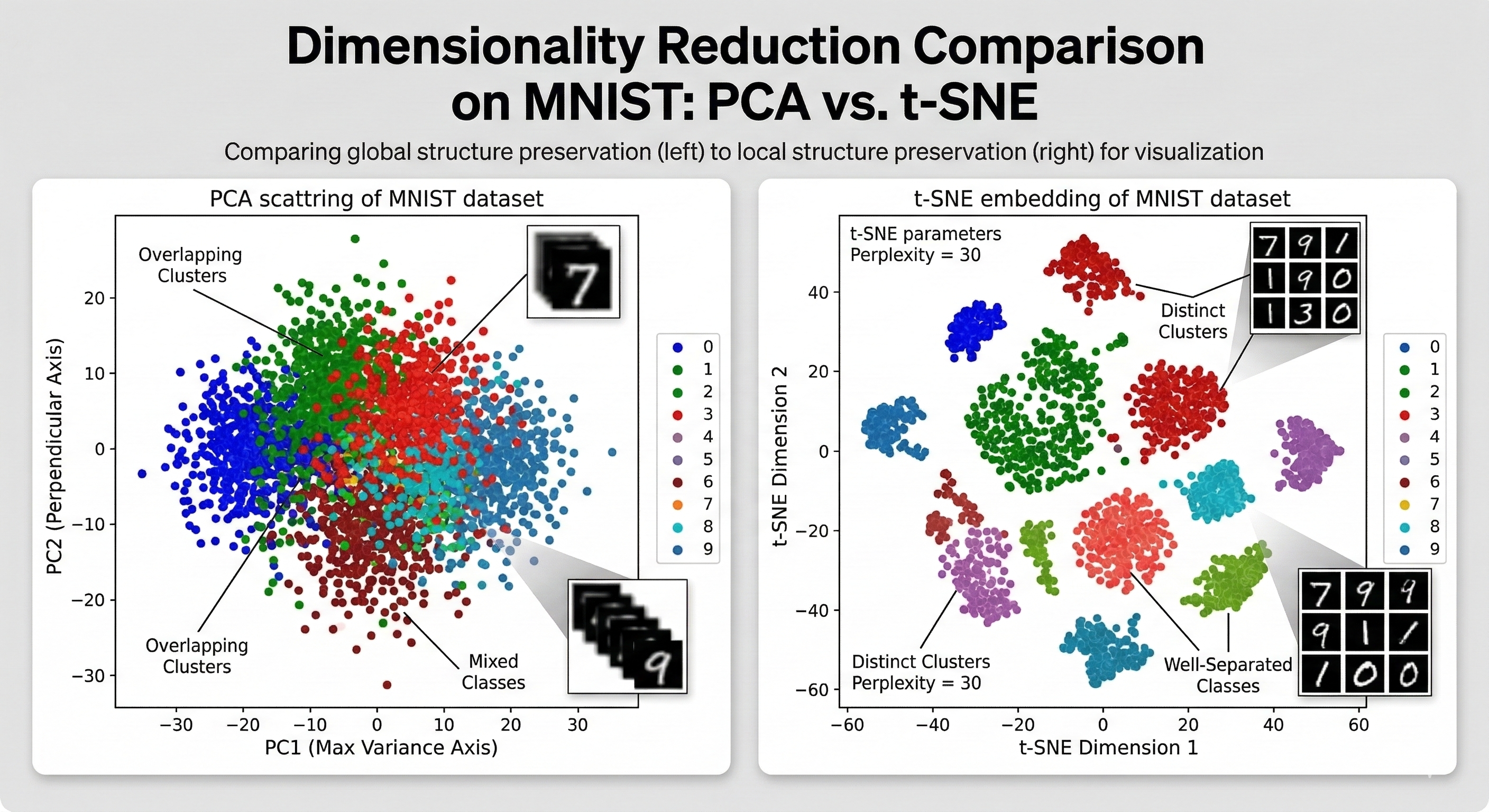
t-SNE: Preserve the Neighborhood
If PCA is a satellite photo that captures the broad layout of a continent, t-Distributed Stochastic Neighbor Embedding (t-SNE) is a hand-drawn map of a neighborhood.
While the linear methods we discussed (PCA, SVD, LDA) focus on preserving the global structure, like they are trying to keep the furthest points as far apart as possible, t-SNE cares almost exclusively about local structure. It wants to ensure that points that were neighbors in 100D space remain neighbors in 2D space.
The Crowding Problem
To understand why t-SNE exists, we have to look at the Crowding Problem. Imagine you have ten friends, and in a high-dimensional social network everyone is exactly 5 units of distance away from each other. This is mathematically possible in higher dimensions. However, when you try to collapse that 10D friendship web onto a 2D piece of paper, you physically run out of room.
There is simply not enough area in 2D to keep ten points equidistant from one another. If you try to force it, the points in the center get crowded and start overlapping, creating a messy blob where you cannot tell who is who.
Linear methods like PCA often fail here because they are too rigid. They try to project the entire high-dimensional shape onto a flat surface at once, which crushes these distinct relationships into a single pile. t-SNE solves this by being rubbery. It does not care about the exact miles between New York and Sydney, it just wants to make sure the people in the same apartment building are still standing next to each other on the map. So by prioritizing these local neighborhoods over the global map, it allows the data to breathe and prevents the points from suffocating each other in the center.
The Mechanics of the t-Distribution
The t-SNE algorithm functions by comparing how points relate to each other in high-dimensional space versus low-dimensional space.
First, it looks at the high-dimensional space and calculates a similarity score for every pair of points. It uses a Gaussian (Normal) distribution to define these relationships. In this stage, if two points are close, they get a high similarity score. If they are far, their score drops off almost to zero. This ensures the algorithm only focuses on immediate neighbors.
Second, it creates a random scatter of points in 2D and tries to match those original high-dimensional scores. But here is the trick, in 2D, it uses a Student’s t-distribution instead of a Normal distribution.
The t-distribution has heavier tails, which is the core idea for solving the crowding problem. Geometrically, this makes the algorithm more forgiving of distance. Because the tails of the t-distribution are higher, points that are moderately far apart are pushed even further away in the 2D map to maintain their relative similarity. This effectively pushes the clusters apart and creates the white space needed to see the gaps between groups that would otherwise be squashed together.
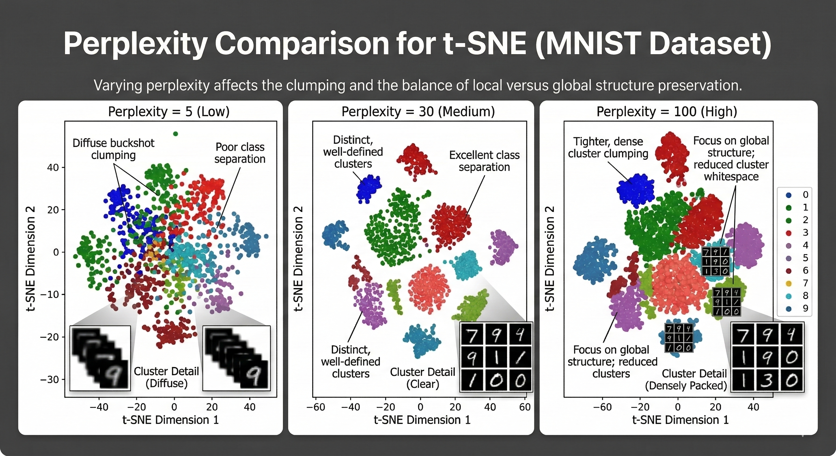
A Note on Perplexity
When using t-SNE, you will encounter a hyperparameter called Perplexity. This setting dictates how many neighbors each point should consider when trying to find its place in the new 2D map.
Low Perplexity forces the algorithm to focus on only a few immediate neighbors. This usually results in many small and tight clusters, but you risk losing the broader context of how these clusters relate to each other. High Perplexity encourages the algorithm to consider a much larger group of neighbors. This gives the model a better sense of the global shape of the data, but if it is too high, the individual clusters might lose their distinct boundaries.
Finding the right balance is more of an art than a science. If the value is too low, the data looks like scattered buckshot with no clear meaning. If it is too high, everything merges into a single unrecognizable cloud. Most practitioners treat this as a dial that needs to be tuned until the underlying structure of the data finally clicks into focus.
A Technical Summary of the t-SNE Process
t-SNE reduces dimensionality by transforming Euclidean distances into probabilities to ensure that local neighborhoods remain intact during the projection.
The mathematical process follows a specific logic
- We calculate the similarity scores between every pair of points in the high-dimensional space using a Gaussian distribution to define the probability of them being neighbors
- We create a random map in 2D and calculate a new set of similarity scores using a Student’s t-distribution which provides the heavier tails needed to prevent points from crowding each other
- We use Kullback-Leibler (KL) Divergence to measure the total error or mismatch between the high-dimensional neighbor probabilities and the low-dimensional ones
- We perform Gradient Descent to iteratively move the points in the 2D map until the KL Divergence is as low as possible
Projecting data through this probabilistic lens preserves the local clusters that linear methods often crush together. This effectively transforms a crowded high-dimensional room into an organized seating chart where every distinct group finally has enough space to breathe.
UMAP: Map the Manifold
If t-SNE is a hand drawn map of a neighborhood, Uniform Manifold Approximation and Projection (UMAP) is a high-tech GPS system. It is faster, more scalable, and manages to solve the biggest weakness of t-SNE, which is the loss of global structure.
While t-SNE is fantastic at showing you who your neighbors are, it often loses the big picture. On a t-SNE map, two clusters might be on opposite sides of the screen simply because the algorithm ran out of room, not because they are actually unrelated. UMAP uses a more sophisticated mathematical foundation to ensure that the distance between clusters actually means something.
The Topology of Data
UMAP is built on a branch of math called Algebraic Topology. You can think of this field as the study of the fundamental shape of a space by looking at what remains the same when you stretch or bend it without tearing it.
In data science, the intuition is that data points are not just random dots. They are actually discrete samples taken from a hidden and continuous shape called a manifold. UMAP uses topology to approximate the skeleton of this invisible manifold so it can be flattened into a lower dimension without losing its essential structure.
The process begins by reconstructing this skeleton through a series of mathematical connections. UMAP looks at each point and draws a boundary around it to identify its nearest neighbors. Rather than using a hard cutoff where a point is either a neighbor or it is not, the algorithm uses a weighted connection that fades as distance increases. This ensures that every single point is connected to at least one other point to prevent any data from being isolated or ignored. Once this high-dimensional network is established, the algorithm finds the best way to lay it out in 2D. It treats the connections between points like a system of springs that pull or push against each other until the 2D layout mirrors the original high-dimensional structure as closely as possible.
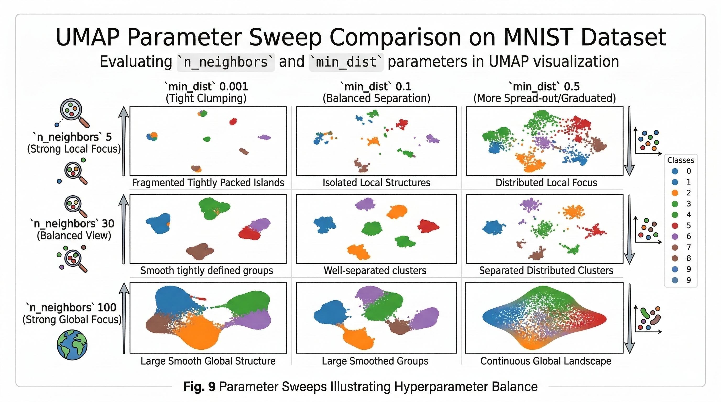
Tuning the Focus with n_neighbors and min_dist
UMAP requires two main parameters to get the perfect visualization.
The first parameter is n_neighbors, which functions as the UMAP equivalent of perplexity. This setting controls how much the algorithm looks at the local versus global structure of the data. When you set this to a low value like 5, the algorithm focuses on very small neighborhoods. This leads to very detailed local clusters but can make the overall map look disconnected. A high value like 50 forces the algorithm to look at the broader landscape. This preserves the overall shape of the data at the expense of fine-grained detail.
The second parameter is min_dist, which determines how closely UMAP allows points to be packed together in 2D. A low value like 0.001 allows points to clump tightly. This is great for seeing distinct clusters that appear as dense islands. Conversely, a high value like 0.5 forces the points to stay more spread out. This setting is better for seeing continuous gradients or the natural flow of data rather than isolated groups.
Why Data Scientists Love UMAP
UMAP has quickly become the gold standard for non-linear dimensionality reduction for three reasons.
First, it is very fast. You can run UMAP on millions of data points in the time it takes t-SNE to process a few thousand.
Second, it is stable. You can fit a UMAP model on one dataset and then use that same model to transform new and incoming data points, which is something t-SNE cannot do.
Finally, it preserves the global structure, meaning the relative positions of the clusters actually tell you something about how the categories relate to one another.
A Technical Summary of the UMAP Process
UMAP reduces dimensionality by approximating the underlying manifold structure of the data and projecting it into a lower-dimensional space while preserving both local and global relationships.
The mathematical process follows a specific logic
- We construct a weighted k-nearest neighbor graph to identify the immediate local relationships between every data point
- We create a fuzzy simplicial set by using a fuzzy union to ensure the graph is locally connected and captures the true topology of the data
- We initialize the new coordinates using Spectral Embedding which provides a mathematical head start for preserving the global structure
- We define the cross-entropy between the high-dimensional fuzzy set and the low-dimensional representation to measure the layout error
- We use Stochastic Gradient Descent (SGD) to minimize that error until the points in 2D or 3D accurately mirror the original high-dimensional shape
Projecting data through this topological lens allows us to unroll complex clusters into a clear visualization.
Autoencoders: Reconstruct the Signal
While PCA and UMAP rely on linear algebra and topology, Autoencoders move us into deep learning. An Autoencoder is a type of neural network designed to learn a compressed representation of the data by trying to reconstruct the input as perfectly as possible. This makes them incredibly flexible because they can handle non-linear relationships that traditional math might miss.
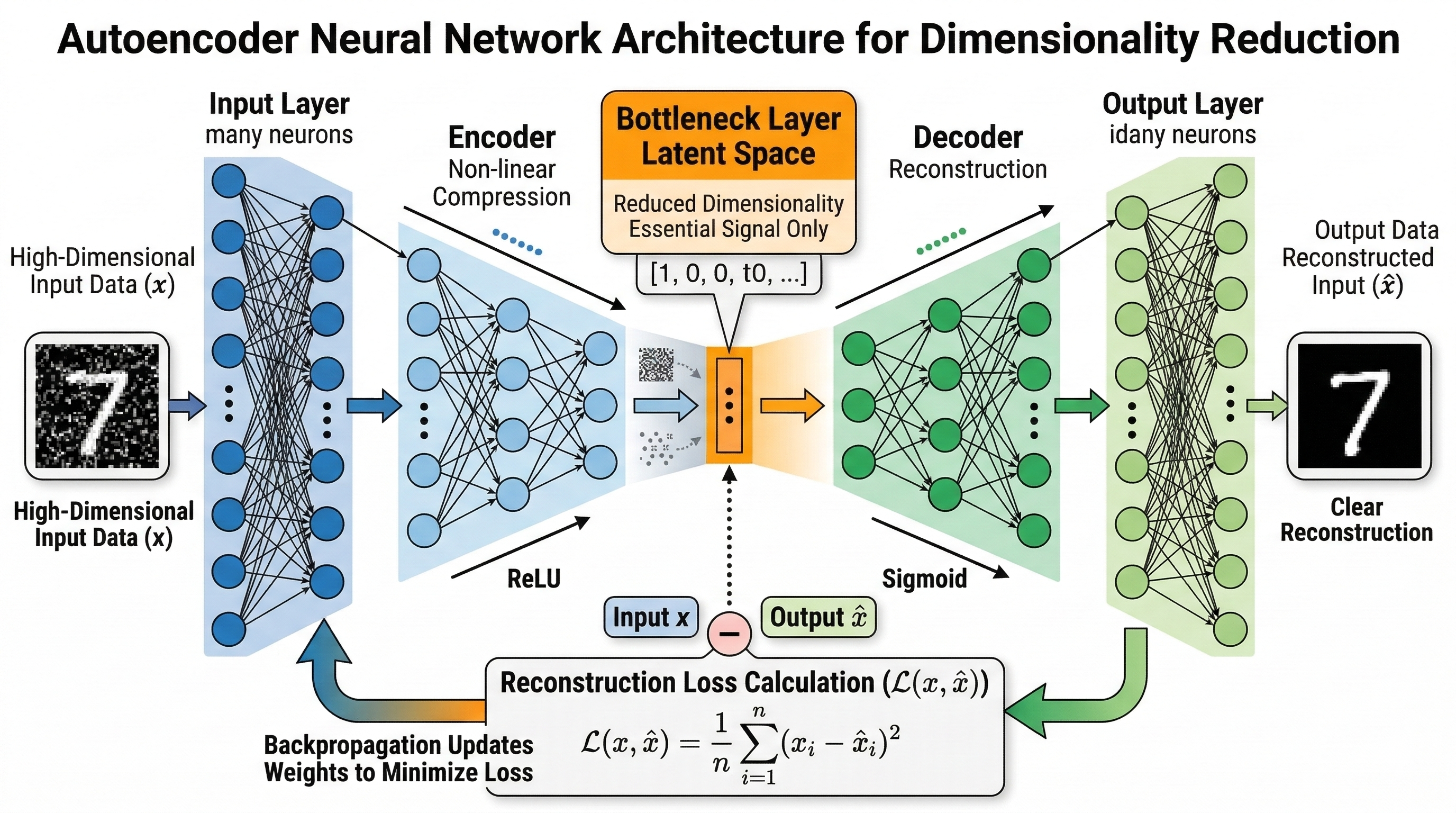
The architecture follows a distinct hourglass shape. It starts with the Encoder, which takes your high-dimensional input and progressively squashes it through smaller and smaller layers. The narrowest part of this network is the Bottleneck or latent space. This is where the dimensionality reduction actually happens. Because the network has fewer neurons here than in the input, it is forced to discard the noise and keep only the most vital features. After the bottleneck comes the Decoder. Its job is to take that tiny compressed code and expand it back into the original data format.
The Bottleneck Intuition
Imagine trying to describe a movie to a friend using only five words. You cannot mention every character or plot twist, so you have to pick the most defining elements that capture the spirit of the film. The bottleneck in an autoencoder works exactly like that word limit. It forces the network to ignore the background jitter and focus on the structural patterns that actually matter. If the network can successfully rebuild the movie from those five words, it means it has truly learned the essence of the data.
By stacking more layers, you can create a Deep Autoencoder that captures extremely complex patterns in images or audio. The primary benefit here is that you are not limited to straight lines or flat planes. The network can bend and twist the data into whatever shape represents the core information best. This makes them a favorite for tasks like denoising images or detecting anomalies in financial transactions where the signal is hidden under layers of noise.
A Technical Summary of the Autoencoder Process
The process relies on minimizing the difference between what goes in and what comes out.
- The Input Layer receives the high-dimensional data points.
- The Encoder layers compress the data using non-linear activation functions like ReLU or Sigmoid.
- The Latent Space Layer represents the reduced dimensions where the data is most compact.
- The Decoder layers attempt to reverse the compression to mirror the original input.
- The Reconstruction Loss is calculated using Mean Squared Error to measure how much information was lost.
- Backpropagation updates the weights across the entire network to minimize this error over time.
By the end of the training, the encoder becomes a specialized tool for dimensionality reduction. You can discard the decoder and use the encoder to transform any new data into a lean, efficient version of itself.
Final Thoughts
We opened with the choice between a stubborn model and a sensitive one. Dimensionality reduction fixes that sensitivity. It is a form of principled forgetting where we force the algorithm to ignore the noise to finally find the signal.
Every time we rotate an axis or map a manifold, we make a trade. We accept a bit of oversimplification to stop the model from chasing every minor fluctuation in the data. By slashing that variance, we move toward the mathematical sweet spot.
The mission is identical regardless the simplification goal. You are hunting for the simplest truth in the messy data. Sometimes the only way to see the big picture is to leave a few dimensions behind.